UX DESIGN
When getting a quote for this bank’s home insurance on their app, customers would abandon the process midway. The challenge was to increase user engagement and make the product speak to our users' needs.
TL;DR
The bank's home insurance product was experiencing low retention as users were dropping out of the app. Through user insights, I designed improvements that led to an increase in conversion rates.
My role
As UX designer in the insurance department, I maintained the bank's insurance products across platforms, and I designed new features.
Client
CaixaBank, a Spanish bank. As NTT Data consultant.
Background
What was the context?
The bank's home insurance product was not performing as expected, as users were dropping out of the app, leading to a decrease in conversion rates.
The problem
We experienced low conversion rates during the process in which users would get a home insurance quote through the bank's app. The challenge was to increase user engagement, and therefore, increase conversion rates, and as a bonus, tailor the product according to our users' needs.
The solution
Improved user experienced by creating a less confusing interface, which led to an increase in conversion rates from 7% to 10%.

Scrrens that presented low conversion rates
Discovery
Where are users not converting?
We identified three main moments during the process that had low conversion rates:
The first screen of the process where users learn about the product's benefits.
The screen where users need to put the size of the house to be insured.
The screen where users were asked about their postal code.
At this stage, I conducted competitive analysis to see how the competition was handling these screens.

The flow, as the user navigates through the app to get a quote
Appraoch
Hypothesis and plan of action
I discussed with data analyst and product owner to understand why these particular screens were problematic, and we came up with these hypothesis:
Users were unsure about starting the process, or the product's benefits didn't resonate with them.
Some users might not know the exact size of their property, leaving the app to get this information.
Users didn't know how to continue with the process because of usability issues.
Based on these hypothesis we decided to conduct user interviews to understand the motivations users had when purchasing a home insurance.

Workshop sessions
Technical and legal constrains
The technology used for our part of the app did not allow me to make any major structural changes, meaning I could only modify the CMS.
For legal reasons, some data fields needed to be exact and unambiguous, which limited how we phrased the information in each screen.
Research
User patterns and insights
We wanted to identify behavioural patterns and discover why users would leave the app, so with the help of the research team we conducted user interviews.
The interview was broken down in two groups: Users who successfully purchased the insurance, and users who were identified as having left during the process.

Some insights from the user interviews
Some insights about each of our screens
Users would rather talk to their agent to ask questions and learn more about the insurance coverage.
Users know the information being asked, but won't trust the final price if they write an approximation in case of doubt.
Users know their postal code, but they leave because they don't trust the screen or prefer going to an office.
Ideation
Flows and wireframes
I started by sketching out the possible solutions in the form of wireframes. The changes I could apply included:
Changing the copy
Moving some components within a screen
Adding extra small features to either make information clearer or make the process more intuitive and easier to use

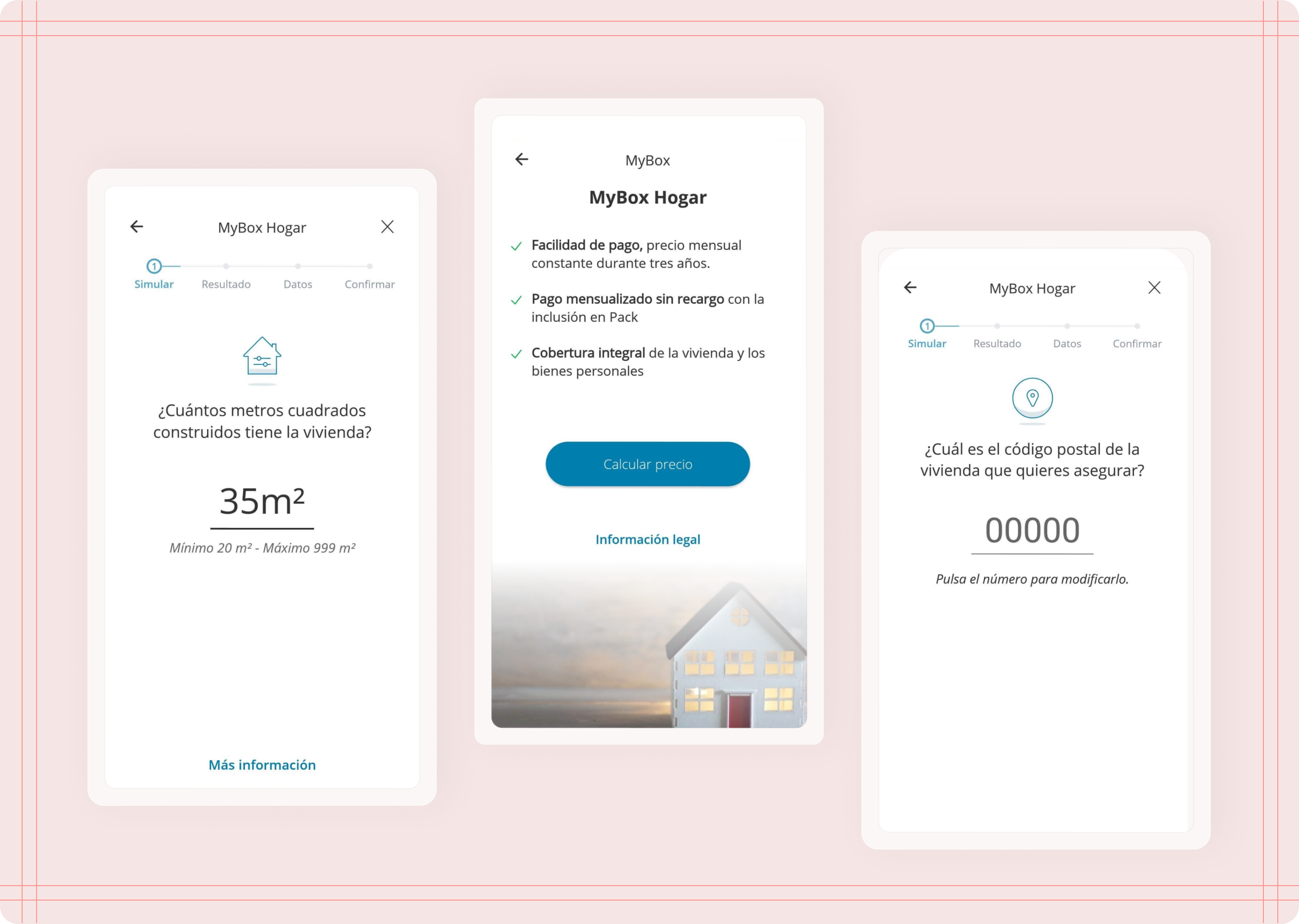
Wireframes exploring some potential solutions - Benefits and square meter screens

Wireframes exploring some potential solutions - Postal code screens
Solution
Solution #1: Benefits that fit user needs
Main issue:
Lack of clear explanation of benefits that spoke to user's needs.
Solution:
Better brekdown of benefits. New version with mroe engaging content.
I decided to modify the text to better align with the needs and preferences of our users, making MBH more appealing. Additionally, since users feel more comfortable with their agents, I changed the approach to emphasise that we are with them throughout the process.

Solution 1 - Benefits
Solution
Solution #2: Legal information that's easier to understand
Main issue:
Some information required by law needed to be exact and not an approximation. The way we asked this led user to be confused and unsure.
Solution:
Working around legalities, I simplified the language used to make the content easier to understand, and also included additional clarifying information.
The number provided by users had to be the exact square meters of their properties due to legalities. Therefore, I could only modify the text to be clearer and easier to understand.

Solution 2 - Square meters
Solution
Solution #3: Affordability that's clear for the user
Main issue:
One of the fileds that asked for the user's postal code did not clearly showed the suer that tapping on the input field (a line in the middle of the screen) opened the keyboard to type their information.
Solution:
I modified the component to include more indicators such as helper texts and examples to guide the user.
The postal code screen proved to be the trickiest because we didn’t understand why users would leave at this point in the flow. Our hypothesis was that the screen was not intuitive enough, causing confusion and preventing users from knowing how to proceed. To address this issue, I added an example and text to guide users on how to input their postal code.

Solution 3 - Postal code
Reflections & next steps
Results and final thoughts
After implementing these changes, we looked at the numbers again to confirm that the solutions improved the experience, and we discovered that the solutions improved user experience by creating a less confusing interface, which led to an increase in conversion rates from 7% to 10%.
Dependencies were definitely the cause of a few obstacles, but this helped us strengthen our bond with other teams and it made it smoother to work with them in other projects.
The changes that I applied did have a significant impact on user engagement and conversion rates, which overall set the project off to a great start.